KONINKLIJKE HARMONIE SINTE-CECILIA
Translating 190 years of heritage into a visual identity built for the future.
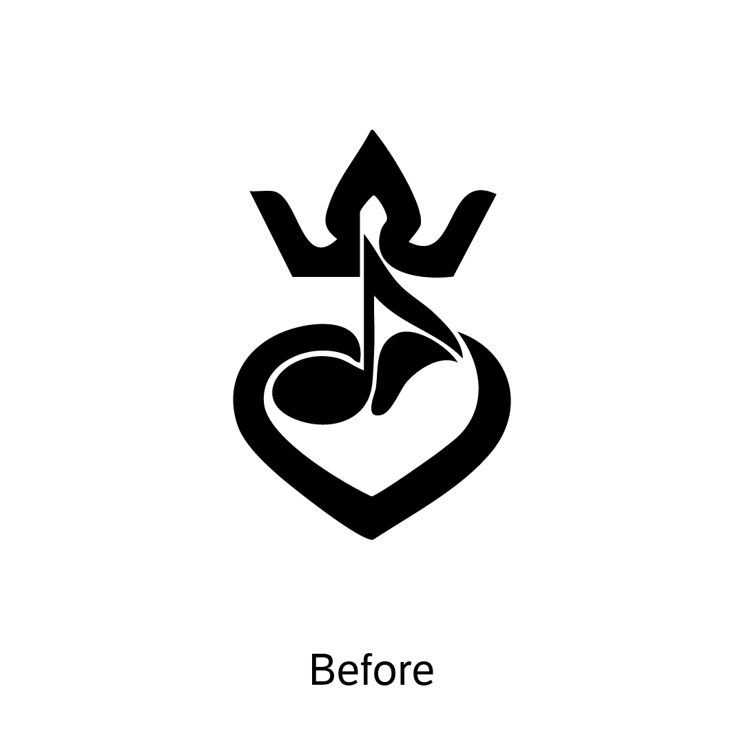
Harmonie Sinte-Cecilia Zele has been part of the community since 1833. Their story is rich — but their visual identity hadn't kept pace. The challenge was to create something new that honours the past without being trapped by it. Something every member, from oldest to youngest, could feel proud to wear and represent.
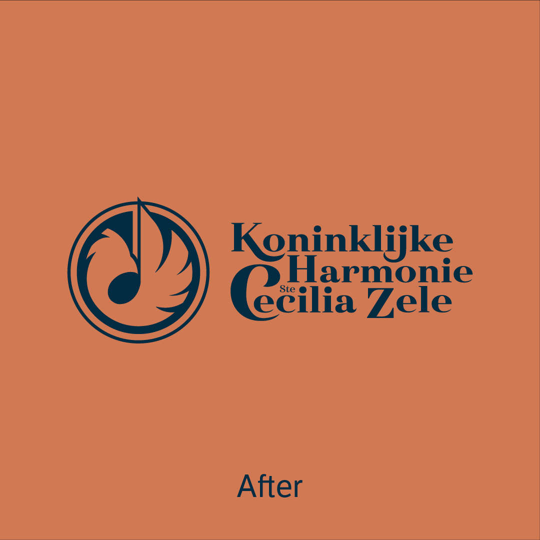
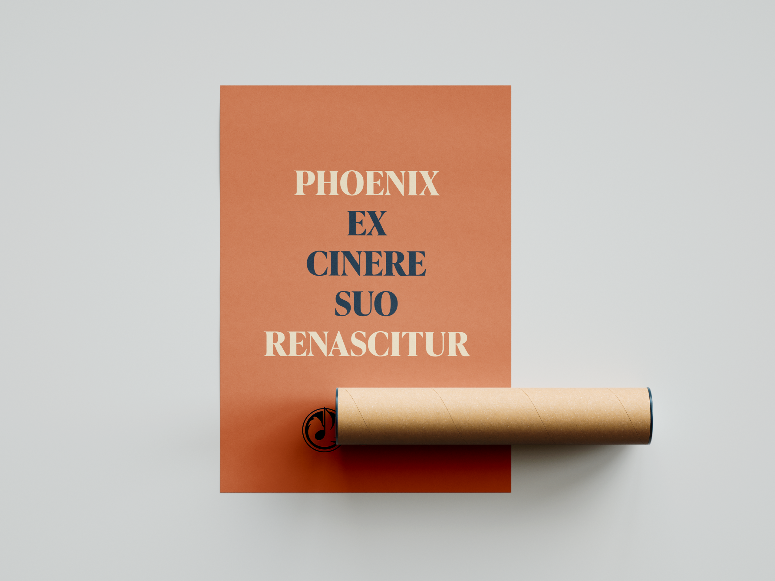
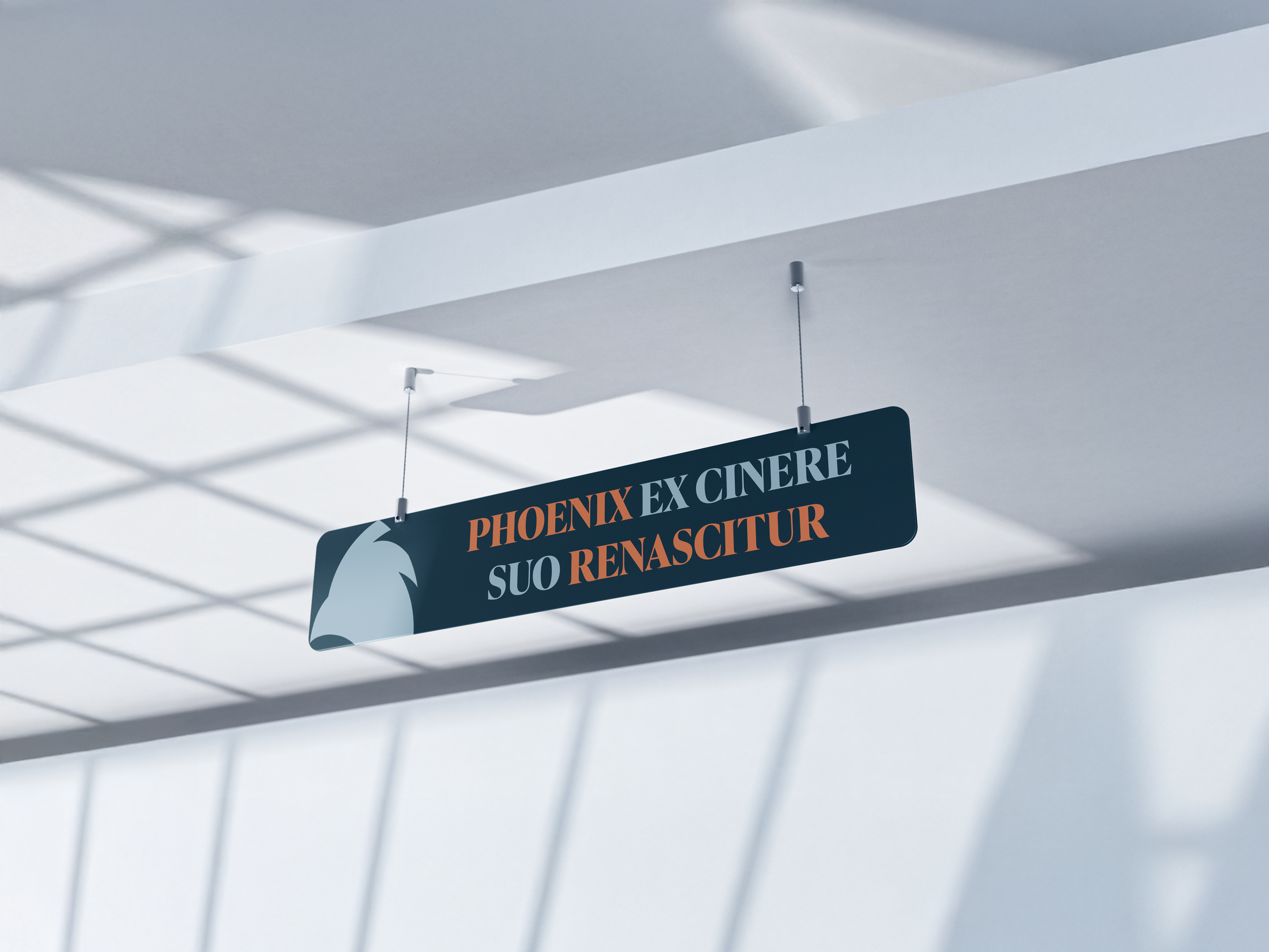
THE POWER OF THE PHOENIX
A symbol that carries history forward, not backward.
The new identity is built around the phoenix — chosen not for aesthetics, but because it mirrors what this organisation truly represents: something that has survived generations and keeps reinventing itself. The flowing lines reference musical phrasing and sound waves, grounding the symbol in what the harmonie does. Structure and movement. Precision and emotion. Past and future — in one mark.
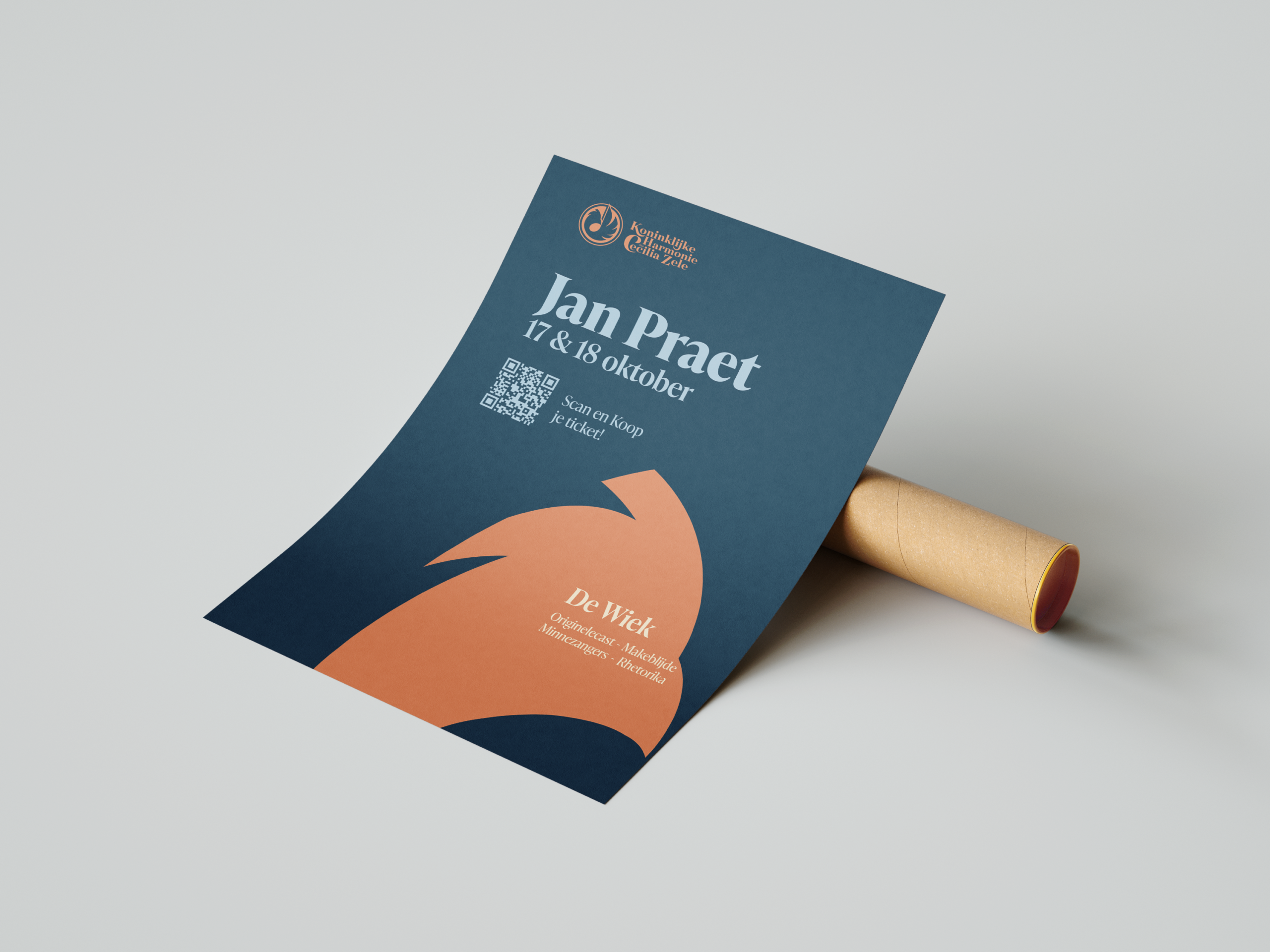
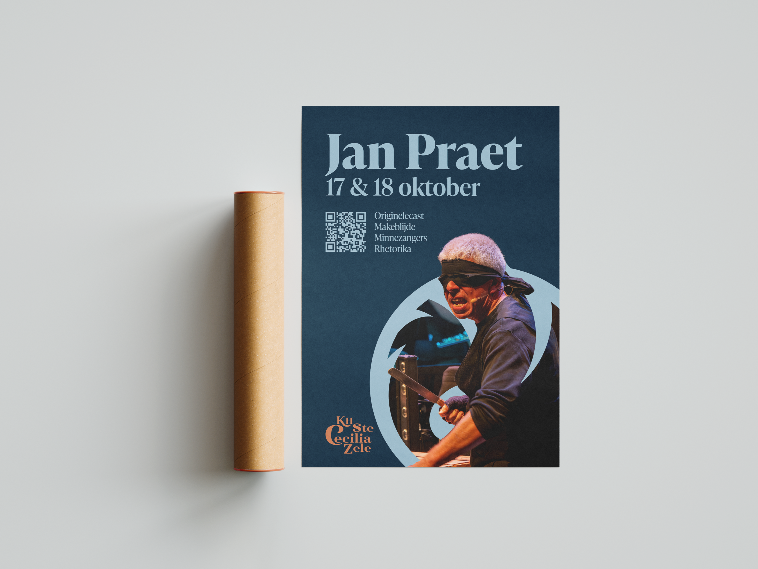
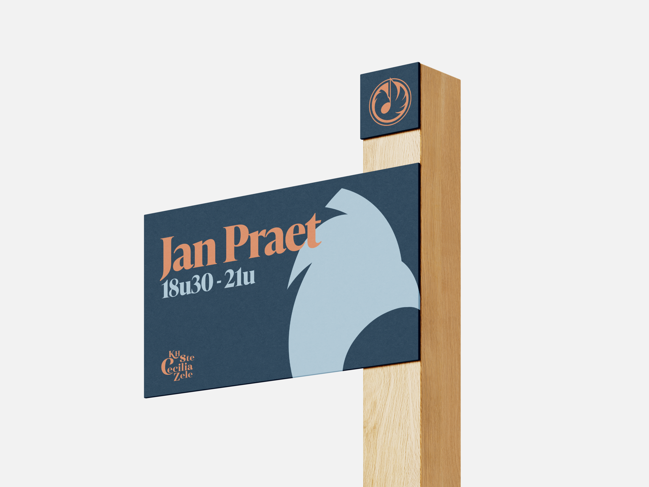
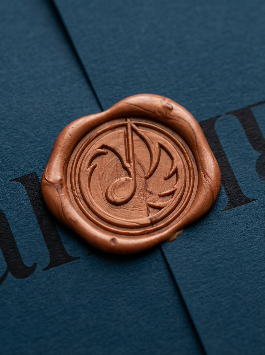
A SYSTEM, NOT JUST A LOGO
A strong identity works everywhere — or it doesn't work at all.
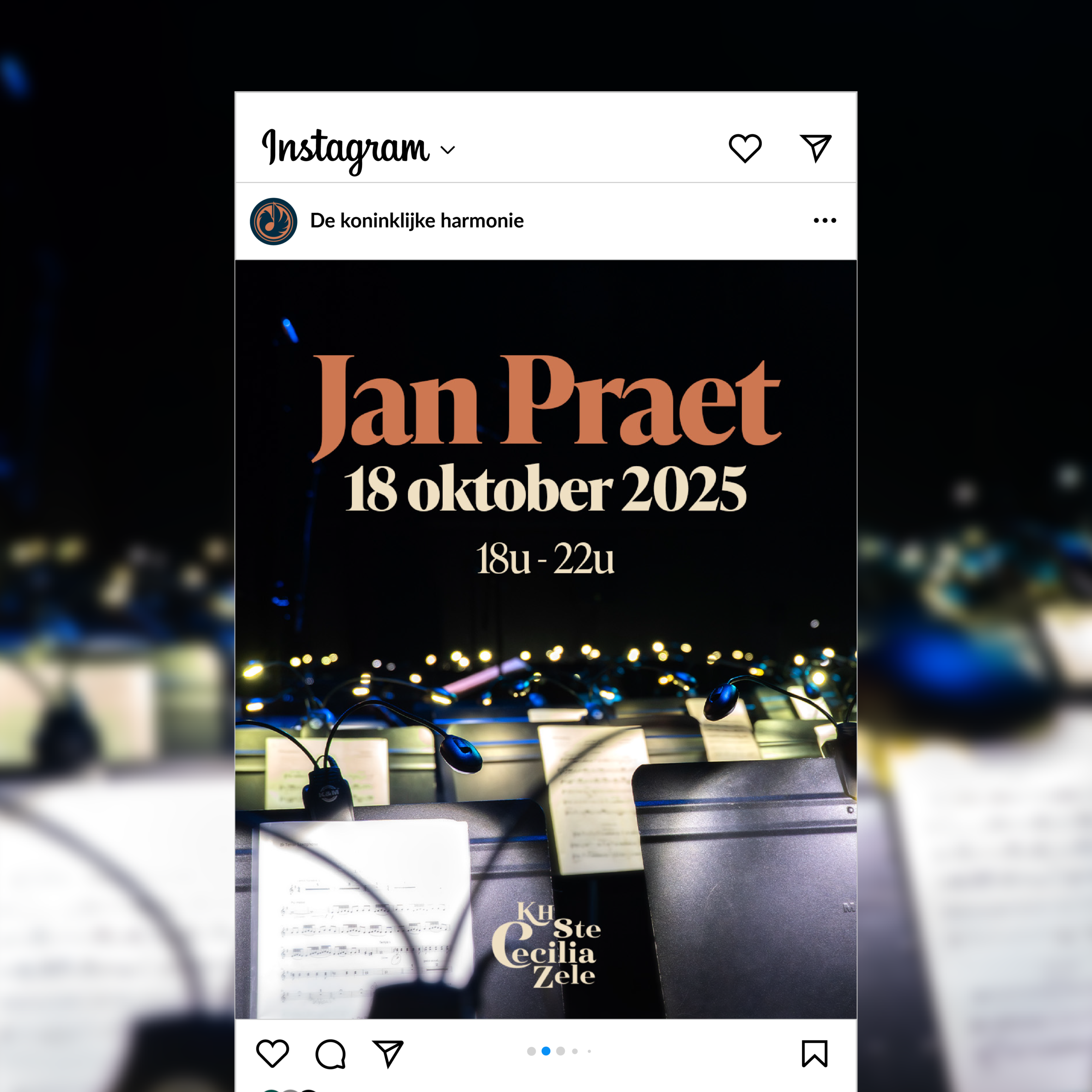
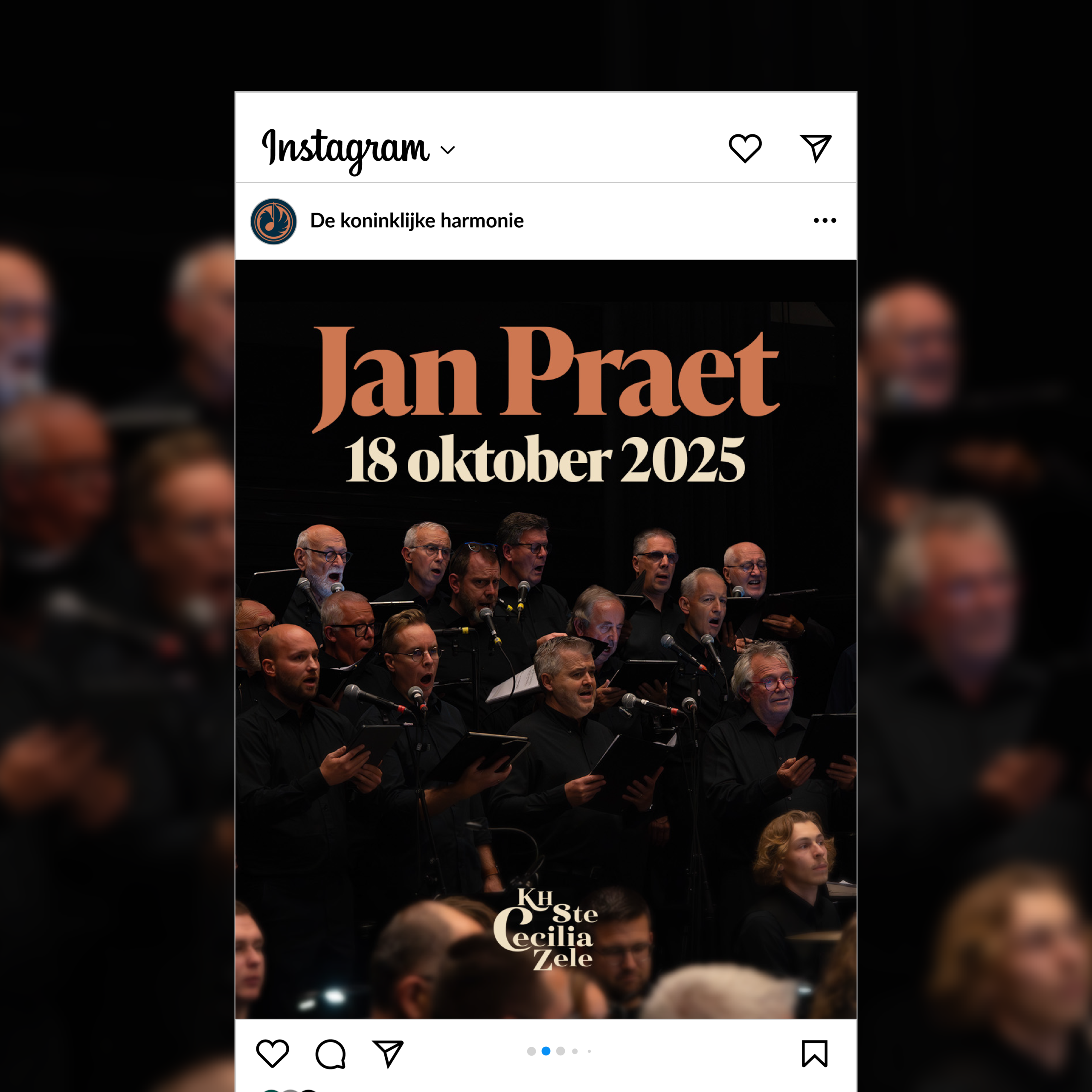
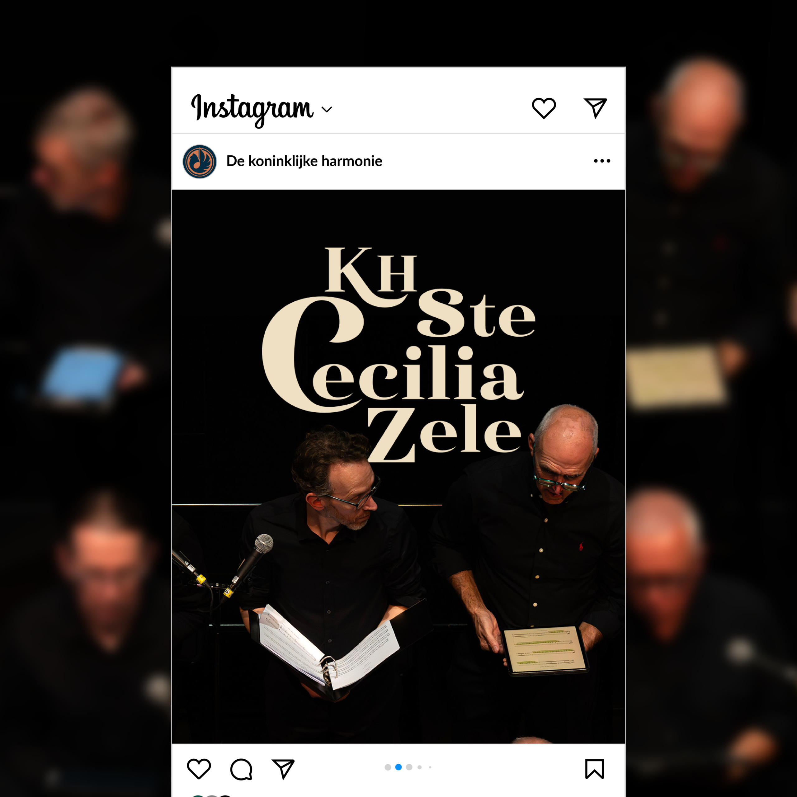
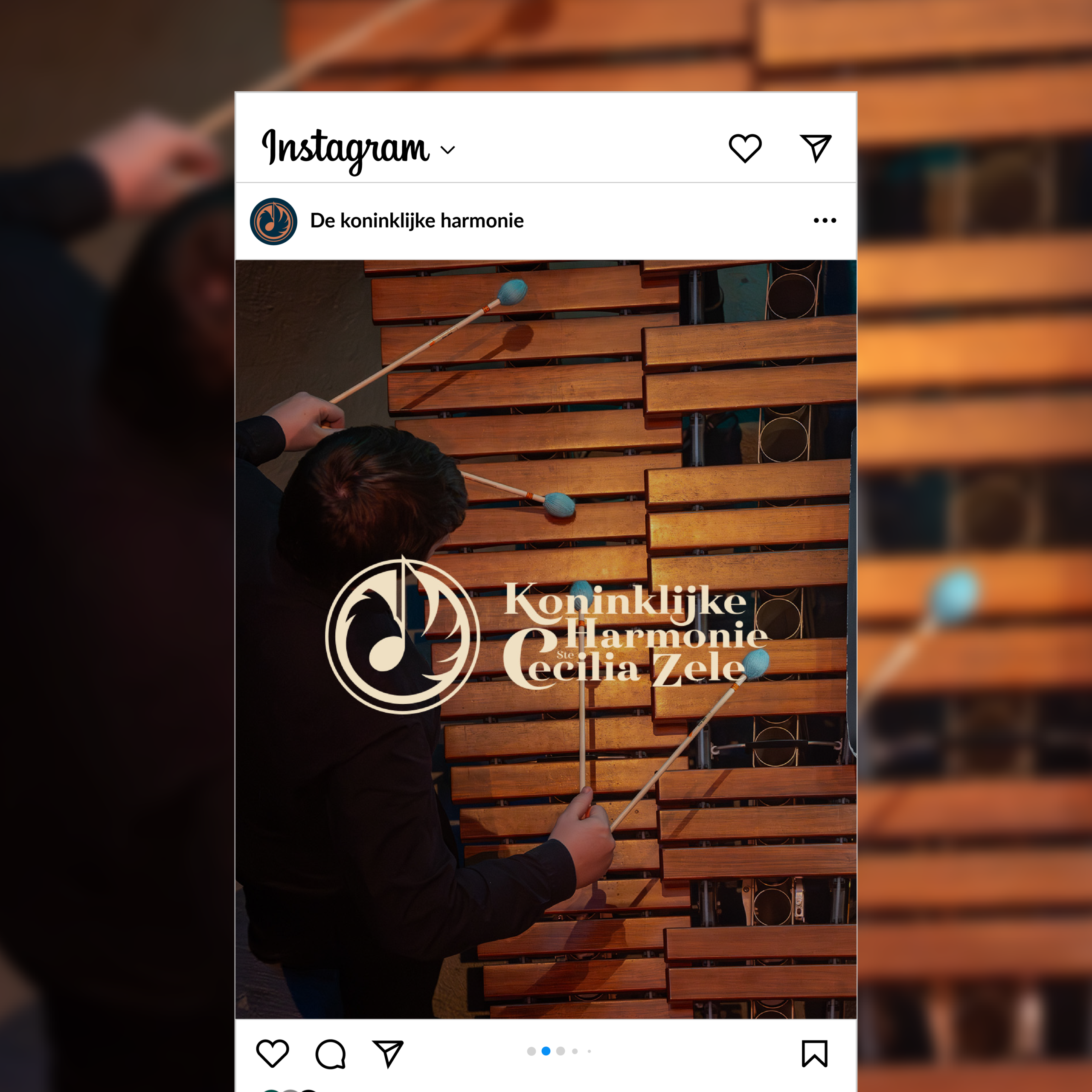
A logo is only as strong as the system around it. For Harmonie Sinte-Cecilia, the new identity was rolled out across every touchpoint: posters, signage, social media templates, and print communication. Each application was designed to feel consistent without being rigid — giving the organisation the flexibility to communicate across different formats while always looking unmistakably like themselves.
WORN WITH PRIDE
When members wear the identity, it becomes part of the culture.
The identity extends beyond communication into physical objects that members carry and wear. Lapel pins, cufflinks, branded instruments, official stamps — every detail designed to make members feel connected to something worth representing. This is what separates a rebrand from a reskin. It lives in the real world.